The Psychology of Texture in Wellness Photography
 A smooth glass bottle can look expensive, a rough stone can feel grounding, and a folded piece of linen can quietly whisper, "perhaps life is manageable after all." Wellness photography works on the mind long before logic arrives with its clipboard. People respond to surfaces instinctively, and texture often carries more emotional weight than colour or branding alone.
Health and wellness imagery is filled with tactile cues. Skincare products sit beside pebbles, herbal teas rest on weathered wood, and soft towels appear with suspicious punctuality. None of this happens by accident. Texture shapes how audiences judge comfort, quality, trust, and care.
Photographs do more than show products or spaces. They suggest how something might feel to hold, touch, or experience. That suggestion is powerful. People cannot physically interact with an image, yet their brains attempt the journey anyway. A well-photographed wellness product creates a sensory shortcut.
Why Texture Matters More Than People Realise
Texture gives photographs emotional temperature.Humans interpret surfaces through memory. A polished surface may suggest cleanliness or precision. Worn timber often signals warmth and authenticity. Linen can imply softness and calm, while natural stone introduces a feeling of permanence and balance. These reactions happen quickly and usually without conscious analysis.
Psychologists often discuss sensory association and visual perception as connected experiences. When viewers see texture, they do not merely register shape and colour. They mentally compare those surfaces to memories of touch. This process influences judgement in subtle but important ways.
That matters enormously in wellness photography because the category depends heavily on trust. People want reassurance when viewing skincare, supplements, spa treatments, therapy spaces, or holistic products. They look for visual signs that communicate care and credibility before they ever read a description.
A clinical setting photographed with cold reflections and harsh surfaces may appear sterile or intimidating. The same environment, photographed with softer materials and careful attention to texture, can feel professional while still appearing welcoming.
Texture also slows people down.
Modern audiences scroll at astonishing speed, treating entire galleries of images like competitive sprint events. Yet tactile detail has a curious ability to interrupt that behaviour. Visible fibres, natural grain, or subtle surface variations invite the eye to pause and explore.
This is why wellness photography rarely succeeds when every surface appears perfectly smooth or aggressively polished. Flawless imagery can look impressive, but it may also feel distant. A little texture introduces humanity.
Ironically, the pursuit of perfection sometimes creates the least believable photographs. A towel with no fold, a stone with no variation, or a cream surface edited into glossy submission can look less like wellbeing and more like it has been prepared for customs inspection.
Texture, handled thoughtfully, helps wellness photography feel lived in rather than manufactured. That distinction matters more than many brands realise.
Surfaces That Shape Perception
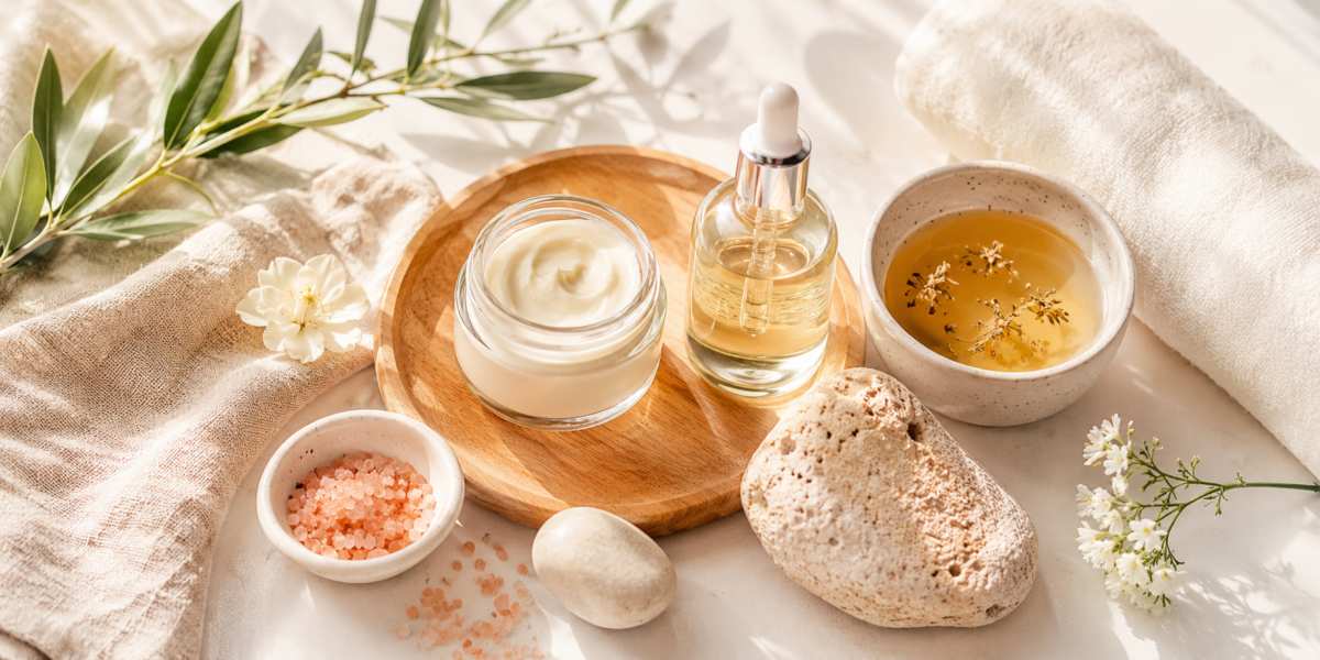
Different materials carry distinct emotional associations, which is why surface choice should never be treated as a last-minute styling decision. The background beneath a product, the prop beside it, and the material catching the light all influence how the viewer reads the image.Wood often communicates honesty and warmth. Light oak and unfinished timber suggest simplicity and natural living, while darker woods can introduce sophistication and luxury. The surface itself matters too. Perfectly polished wood feels refined, but visible grain and small imperfections tend to feel more approachable.
Stone brings a different mood. Marble can signal elegance and premium care, while rough rock or slate introduces grounding and stability. Wellness photography frequently pairs stone with skincare or spa imagery because it creates a sense of calm endurance. Stones also remain impressively cooperative during shoots, unlike flowers that decide to wilt moments before greatness.
Glass carries strong psychological signals related to purity and cleanliness. Clear bottles photographed with careful highlights often suggest scientific credibility or premium quality. Frosted glass softens that feeling and can introduce a more calming, understated mood.
Linen deserves special attention. Its visible fibres and gentle folds suggest comfort without appearing overly styled. Unlike perfectly pressed materials that sometimes resemble they were ironed by military engineers, linen feels lived-in and believable. That relaxed quality helps wellness imagery feel personal rather than overly staged.
Skincare and Natural Ingredients Up Close
Close-up photography transforms texture from supporting detail into the main character.Creams, oils, powders, and botanical ingredients all tell stories through their surfaces. Thick moisturisers communicate nourishment. Lightweight gels suggest freshness and energy. Powdered ingredients imply craftsmanship and raw authenticity.
Photographing these textures effectively requires restraint. Overly dramatic editing can flatten delicate detail and make products appear artificial. Wellness audiences increasingly value imagery that feels genuine.
Light becomes essential here. Side lighting often works particularly well because it reveals depth and texture without overwhelming the subject. Soft shadows help ingredients and surfaces retain dimension.
Small imperfections can also be useful. A tiny smear of balm, a few grains of salt, or a slightly uneven pour of oil can make an image feel real. The trick is control. There is a difference between artful naturalness and a product looking as though it lost a minor fight with the worktop.
Article kindly provided by gdholland.co.uk
Latest Articles
- Why Your Fitness Routine Needs More Easy Days, Not More Hard Ones
- The Hidden Hair Loss Triggers Most People Never Think About
- The Mouth-Body Connection Most People Ignore
- The Psychology of Texture in Wellness Photography
- When DIY Beauty Goes Too Far: Treatments Better Left to Professionals
- The Hidden Link Between Jaw Tension and Everyday Headaches
- Sleep Timing Shapes Hormones More Than You Think
- How Subconscious Habits Affect Your Skin Health
- Fragrance Fatigue Is Real: How Smaller Bottles Help Your Nose Stay Sharp
- Traveling with a Baby: Smart Packing Strategies for Modern Parents
- How Oral Health Quietly Influences Energy Sleep and Long Term Well Being
- How Emotions Affect Your Skin
- Everyday Walks as Brain Games for Your Dog
- How Light Weights Can Build Serious Strength
- Missing Dental Supplies and What They're Really Telling You
- Rethinking Early Intervention Strategies for Childhood Behavior Support
- Keep Going: The Brain Science of Turning Setbacks Into Momentum
- Designing Movement Routines That Don't Feel Like Exercise
- Chair Yoga Works Wonders For Bodies Of All Ages
- Eyebrows Through the Ages and What They Reveal About Our Faces
- Nutrition and Dietetics
- Exercise and Fitness
- Meditation and Yoga
- Mental Health
- Women's Health
- Men's Health
- Children's Health
- Senior Health
- Heart Health
- Sleep Health
- Skin Health
- Eye Health
- Dental Health
- Pain Management
- Addiction and Recovery
- Sexual and Reproductive Health
- Alternative Medicine
- Chronic Conditions
- Weight Management
- Occupational Health and Safety
- Public Health
- General Health Tips
- Beauty